Lecture 8 - (05/03/2026)
Today’s Topics:
Probability
Confidence Intervals
Bias Variance Tradeoff
If X is a continuous random variable, then there exists unique nonnegative functions, and where:
is the probability density function
is the cumulative distribution function
import numpy as np
import plotly.graph_objects as go
from scipy.stats import norm

mu, sigma = 0, 1
x = np.linspace(-4, 4, 400)
pdf = norm.pdf(x, mu, sigma)
cdf = norm.cdf(x, mu, sigma)

fig = go.Figure()

fig.add_trace(go.Scatter(
    x=x,
    y=pdf,
    mode="lines",
    name="PDF",
    line=dict(color="black")
))

fig.add_trace(go.Scatter(
    x=[],
    y=[],
    fill="tozeroy",
    mode="lines",
    fillcolor="rgba(0,100,255,0.4)",
    line=dict(width=0),
    name="Integrated Area"
))

fig.add_trace(go.Scatter(
    x=[],
    y=[],
    mode="lines",
    name="CDF",
    line=dict(color="red", width=3)
))

steps = []

for i in range(len(x)):
    xs = x[:i+1]
    ys_pdf = pdf[:i+1]
    ys_cdf = cdf[:i+1]

    step = dict(
        method="update",
        args=[{
            "x": [x, xs, xs],
            "y": [pdf, ys_pdf, ys_cdf]
        }],
        label=f"{x[i]:.2f}"
    )
    steps.append(step)

sliders = [dict(
    active=0,
    currentvalue={"prefix": "Integrate up to x = "},
    pad={"t": 50},
    steps=steps
)]

fig.update_layout(
    sliders=sliders,
    xaxis_title="x",
    yaxis_title="Value",
)

fig.show()But why do we care about this very specific distribution?
The Central Limit Theorem (CLT) states that the sample mean of a sufficiently large number of i.i.d. random variables is approximately normally distributed. The larger the sample, the closer it will be to normal.
Here is a good visualization to show how it comes to be
But not everything we observe is continious, some values are discrete.
Probability Mass
The probability mass function (PMF) or the distribution of a random variable X provides the probability that X takes on each of its possible values.
If we let be the set of values that can take on. The PMF of must satisfy the following rules:
Given the following table:
| Name | Age |
|---|---|
| Alice | 50 |
| Bob | 52 |
| Charlie | 51 |
| Diana | 50 |
What is the probability that someone chosen, uniformly and at random from this set is 50?
Let be a random variable representing the age of the first person chosen uniformly and at random from our set, what is:
We want the fraction of time each value occurs.
Let’s use the accumulator design pattern to automate this:
Initialize count to 0. (not a single value, but an array of values).
Count each value.
Divide through by overall total.
Let represent the result of one roll from a fair six-sided die.
We know that and
We can use this to plot the PMF of X for N trials
Roll a 6-sided die
Add the sum and repeat N times
Divide counts through by N
import plotly.graph_objects as go
import numpy as np

rolls = np.random.randint(1, 7, 1000)

counts = [0,0,0,0,0,0]

for r in rolls:
    counts[r-1] += 1

total = sum(counts)
pmf = [c/total for c in counts]

x = [1,2,3,4,5,6]

fig = go.Figure()

fig.add_trace(go.Bar(
    x=x,
    y=pmf,
    text=[f"{p:.3f}" for p in pmf],
    textposition="outside"
))

fig.update_layout(
    xaxis_title="Dice Value",
    yaxis_title="Probability",
    yaxis=dict(range=[0,1])
)

fig.show()This specfic distribution is called a uniform distribution because each outcome is equally likely.
Right now we need to make a guess to say it’s within reason, let’s formalise a way to confidently say that they are equal.
Confidence Intervals
Assuming that the data is normally distributed, the 95% confidence interval can be computed as:
Lower bound:
Upper bound:
where:
= sample mean
= confidence level value
= standard deviation
= sample size
Condifence level is inversely related to the statistical significance (), here are some of the common ones used.
| Confidence Level | 90% | 95% | 99% |
|---|---|---|---|
| 0.1 | 0.05 | 0.01 | |
| 1.64 | 1.96 | 2.57 |
Let’s take a look at confidence intervals in action
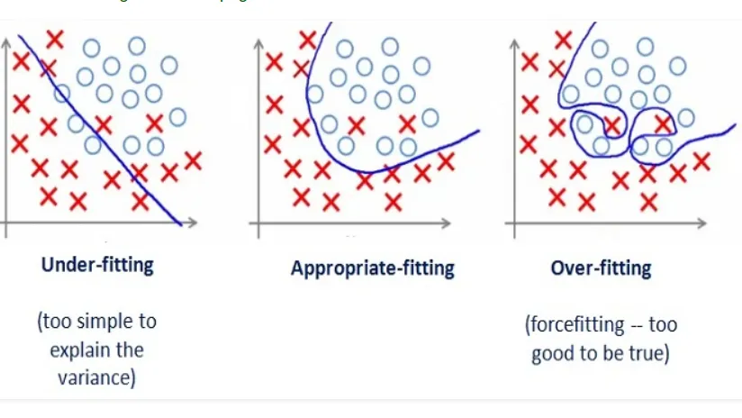
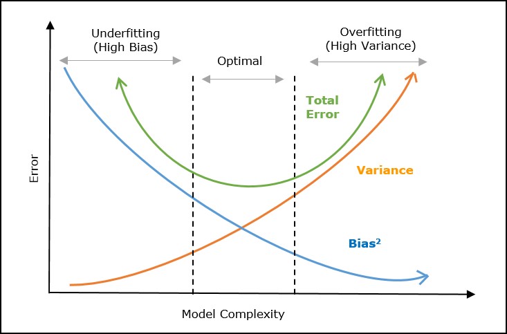
Bias-Variance Tradeoff
Tradeoff in choosing models:
Model Bias: Too simple to represent the underlying data generation process
Model Variance: Complex but fits the noise in the data rather than the data’s overall pattern.
To reduce bias:
Choose a more complicated model
Add more features
To reduce variance:
Simplify the model
Add more data
Even in the most perfect model, we will need to balance some form of bias and variance to find the local minima.
import numpy as np
import plotly.graph_objects as go
from numpy.polynomial.polynomial import Polynomial

np.random.seed(0)
x = np.linspace(0, 10, 20)
y_true = np.sin(x)
y = y_true + np.random.normal(0, 0.3, size=x.shape)

degrees = list(range(1, 15))

fits = []
x_fit = np.linspace(0, 10, 200)
for d in degrees:
    coeffs = np.polyfit(x, y, d)
    y_fit = np.polyval(coeffs, x_fit)
    fits.append(y_fit)

fig = go.Figure()

fig.add_trace(go.Scatter(
    x=x, y=y,
    mode='markers',
    name='Data',
    marker=dict(color='black', size=8)
))

fig.add_trace(go.Scatter(
    x=x_fit, y=fits[0],
    mode='lines',
    name=f'Best fit',
    line=dict(color='blue')
))

steps = []
for i, d in enumerate(degrees):
    step = dict(
        method='update',
        args=[{
            'y':[y, fits[i]],
        },
        {'annotations':[dict(
            x=5, y=1.5, text=f"Polynomial Degree: {d}", showarrow=False,
            font=dict(size=16)
        )]}],
        label=str(d)
    )
    steps.append(step)

sliders = [dict(
    active=0,
    currentvalue={"prefix": "Polynomial Degree: "},
    pad={"t": 50},
    steps=steps
)]

fig.update_layout(
    sliders=sliders,
    annotations=[dict(
        x=5, y=1.5, text=f"Polynomial Degree: {degrees[0]}", showarrow=False,
        font=dict(size=16)
    )]
)

fig.show()