Lecture 6 - (26/02/2026)
Today’s Topics:
Serialization
Visualization
Serializing Objects
Serialization is the act of translating data structures or objects into a format that can be stored and used later.
A standard approach is Pickling:
- Save to a file: `pickle.dump(object, file, ...)`
- Returns a string: `pickle.dumps(object, ...)`
Unpickling is the deserialization of an object:
- Read from a file: `Unpickler(file).load()` or `pickle.load(file, ...)`
- Read from a string: `pickle.loads(bytes_object, ...)`
import pickle
data = {
'a': ['alex', 'alia'],
'b': ['brandon', 'bri'],
'c': ['calvin', 'carmen']
}with open('data.pickle', 'wb') as f:
pickle.dump(data,f,pickle.HIGHEST_PROTOCOL)
# stores data in a file called data.picklewith open('data.pickle', 'rb') as f:
new_data = pickle.load(f)
# reads the data in the file called data.pickle
print(new_data){'a': ['alex', 'alia'], 'b': ['brandon', 'bri'], 'c': ['calvin', 'carmen']}
What can be pickled and unpickled:
None,True,Falseintegers, floating point numbers, complex numbers
strings, bytes, bytearrays
tuples, lists, sets, dictionaries containing picklable objects
functions defined at the top level of a module (def not lambda)
built in functions defined at the top level of a module
classes that are defined at the top level of a module
Visualization
Visualizing Quantitative Data: Histograms
We will use plotly and seaborn as our default for creating plots.
import seaborn as sns
import numpy as np
import statsmodels
import pandas as pd
import plotly.express as px
import plotly.figure_factory as ff
sns.set()
ti = sns.load_dataset('titanic').dropna().reset_index(drop=True)
ff.create_distplot([ti['age']], ['ages'])
# column labelsWe can also control how the data is divided
ff.create_distplot([ti['age']], ['ages'], bin_size=10)Visualizing Quantitative Data: Box Plots
Box plots show where most of the data is.
Usually use 25th and 75th percentiles of the box with “whiskers” capturing rest of data (modulo outliers).
px.box(x=ti['fare'])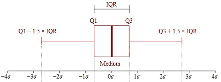
lower, upper = np.percentile(ti['fare'], [25,75])
IQR = upper - lower
print(f'Q1: {lower}\nQ3: {upper}\nIQR: {IQR}')
Q1: 29.7
Q3: 90.0
IQR: 60.3
Can display box plots for different categories:
px.box(x=ti['fare'], y=ti['who'])Visualizing Quantitative Data: Scatter Plots
Scatter plots are used to compare two quantitative variables
px.scatter(ti,x='age',y='fare',color='who',trendline='ols')For qualitative or categorical data, we most often use bar charts and scatter charts.
px.histogram(ti,x='alive')Counting the number of survivors, refining by class:
px.histogram(ti,x='alive',color='class')Visualizing Quantative Data: Time Series
Often data is collected over a period of time.
Pandas recognizes most time/date formats.
Can display and summarize information across time periods.
# load in the dataset
mta = pd.read_csv('https://stjohn.github.io/datasci/spr23/si2020.csv')
mta.head()# compute the rolling average
mta['7DayRolling'] = mta['entries'].rolling(7).mean()Create a line plot of entries and rolling averages:
fig = px.line(mta,x='date', y='entries')
fig.add_scatter(
    x=mta['date'],
    y=mta['7DayRolling'],
    mode='lines',
    name='7-Day Rolling Avg'
)

fig.show()
rolling() is a built-in function that computes a rolling average
Other ways of summarizing information:
cumulativeAverage(column): Returns a Series with the running average of the values.cyclicAverage(column): Assumes data is cyclic, and computes average of points in the cycle. Since ridership is highly dependent on the day of the week, this averages the values of the same day in past weeks.exponentialSmoothing(column): Returns a Series with a weighted average of the previous values with the most recent values have higher weight and the older ones have lower weights. The value for the first entry,newCol[0]iscolumn[0]. The value for subsequent entries isnewCol[t+1]=0.5*column[t+1]+0.5*newCol[t].