Lecture 13 - (24/03/2026)
Today’s Topics:
Review: Decision Boundaries
Principal Component Analysis
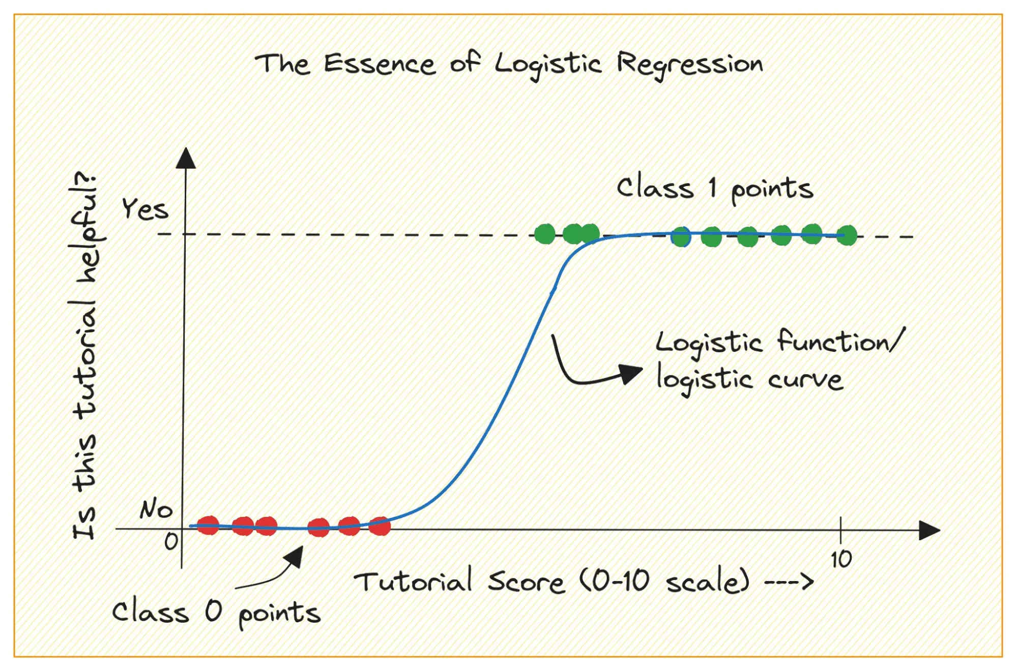
Logistic regression is first and foremost a type of regression - it tries to fit a line to a set of data points. It can be used to model probabilities, effectively turning a regression output into a classification decision. This is why we saw different output probabilities when we applied it to the MNIST example.
The issue here is that we are modelling the probabilities of class membership instead of directly trying to find the seperation between these classes. This is where Support Vector Machines (SVMs) come in. Instead of fitting a line to predict probabilities, SVMs aim to find the optimal boundary that maximizes the margin.
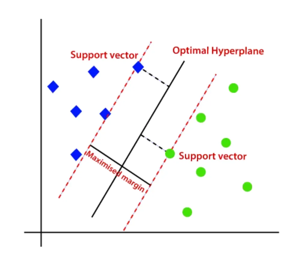
This shift in objective leads to a few key advantages. By maximizing the margin, SVMs often achieve better generalization on unseen data, especially in high-dimensional spaces.
So, while logistic regression models how likely a point belongs to a class, SVMs focus on how confidently the classes can be separated.
Principal Component Analysis
Principal component analysis (PCA) is a fast and flexible unsupervised method for dimensionality reduction in data. Its behavior is easiest to visualize by looking at a two-dimensional dataset. Consider the following 200 points:
import numpy as np
import plotly.express as px
import plotly.graph_objects as go
from plotly.subplots import make_subplots
from sklearn.decomposition import PCA
Source
rng = np.random.RandomState(1)
X = np.dot(rng.rand(2, 2), rng.randn(2, 200)).T

fig = px.scatter(
    x=X[:, 0],
    y=X[:, 1],
    labels={"x": "X1", "y": "X2"}
)

fig.update_layout(
    yaxis_scaleanchor="x",
)

fig.show()By eye, it is clear that there is a nearly linear relationship between the x and y variables. Rather than attempting to predict the y values from the x values like we did in linear regression, the unsupervised learning model attempts to learn about the relationship between the x and y values.
In principal component analysis, this relationship is quantified by finding a list of the principal axes in the data, and using those axes to describe the dataset. Using Scikit-Learn’s PCA estimator, we can compute this as follows:
pca = PCA(n_components=2)
pca.fit(X)The fit learns some quantities from the data, most importantly the “components” and “explained variance”
pca.components_array([[ 0.94446029, 0.32862557],
[-0.32862557, 0.94446029]])pca.explained_variance_array([0.7625315, 0.0184779])To see what these numbers mean, let’s visualize them as vectors over the input data, using the “components” to define the direction of the vector, and the “explained variance” to define the squared-length of the vector:
def draw_vector(fig, v0, v1, col=''):
    fig.add_annotation(
        x=v1[0], y=v1[1],
        ax=v0[0], ay=v0[1],
        xref=f"x{col}", yref=f"y{col}",
        axref=f"x{col}", ayref=f"y{col}",
        showarrow=True,
        arrowhead=3,
        arrowwidth=2
    )
Source
fig = go.Figure()

fig.add_trace(go.Scatter(
    x=X[:, 0],
    y=X[:, 1],
    mode='markers',
    marker=dict(opacity=0.3),
    name='data'
))

for length, vector in zip(pca.explained_variance_, pca.components_):
    v = vector * 3 * np.sqrt(length)
    draw_vector(fig, pca.mean_, pca.mean_ + v)

fig.update_layout(
    xaxis=dict(scaleanchor="y"),
    yaxis=dict(constrain='domain'),
)

fig.show()These vectors represent the principal axes of the data, and the length of the vector is an indication of how important that axis is in describing the distribution of the data—more precisely, it is a measure of the variance of the data when projected onto that axis. The projection of each data point onto the principal axes are the “principal components” of the data.
Essentially, we’ve just found the eigenvectors (and corresponding eigenvalues) of the data’s covariance matrix, which define these directions and their importance.
If we plot these principal components beside the original data, we see the plots shown here:
Source
rng = np.random.RandomState(1)
X = np.dot(rng.rand(2, 2), rng.randn(2, 200)).T

pca = PCA(n_components=2, whiten=True)
pca.fit(X)
X_pca = pca.transform(X)

fig = make_subplots(rows=1, cols=2,
                    subplot_titles=("input", "principal components"))

fig.add_trace(
    go.Scatter(x=X[:, 0], y=X[:, 1],
               mode='markers',
               marker=dict(opacity=0.35),
               name='data'),
    row=1, col=1
)

for length, vector in zip(pca.explained_variance_, pca.components_):
    v = vector * 3 * np.sqrt(length)
    draw_vector(fig, pca.mean_, pca.mean_ + v, col=1)

fig.add_trace(
    go.Scatter(x=X_pca[:, 0], y=X_pca[:, 1],
               mode='markers',
               marker=dict(opacity=0.35),
               name='pca data'),
    row=1, col=2
)

draw_vector(fig, [0, 0], [0, 3], col=2)
draw_vector(fig, [0, 0], [3, 0], col=2)

fig.update_layout(
    width=1000,
    height=500,
    showlegend=False
)

fig.update_xaxes(scaleanchor="y", row=1, col=1)
fig.update_yaxes(constrain='domain', row=1, col=1)

fig.update_xaxes(scaleanchor="y2", range=[-5, 5], title="component 1", row=1, col=2)
fig.update_yaxes(range=[-3, 3.1], title="component 2", row=1, col=2)

fig.update_xaxes(title="x", row=1, col=1)
fig.update_yaxes(title="y", row=1, col=1)

fig.show()This transformation from data axes to principal axes is an affine transformation, which basically means it is composed of a translation, rotation, and uniform scaling.
While this algorithm to find principal components may seem like just a meaningless exploration into mathematics, it turns out to have veryyy far-reaching applications in the world of machine learning and data exploration.
Let’s experiment with PCA here