Lecture 12 - (19/03/2026)
Today’s Topics:
Linear Algebra Review
Linear Seperability
Support Vector Machines
Linear Algebra Recap
Vectors
A vector of length is just a sequence (or array, or tuple) of numbers, which we write as or .
The set of all -vectors is denoted by .
For example, is the plane, and a vector in is just a point in the plane.
Traditionally, vectors are represented visually as arrows from the origin to the point.
import plotly.graph_objects as go
import numpy as np
Source
vecs = [(2, 4), (-3, 3), (-4, -3.5)]

fig = go.Figure()

for v in vecs:
    fig.add_annotation(
        x=v[0], y=v[1],
        ax=0, ay=0,
        xref="x", yref="y",
        axref="x", ayref="y",
        showarrow=True,
        arrowhead=3,
        arrowsize=1.5,
        arrowwidth=3,
        arrowcolor="blue"
    )
    fig.add_annotation(
        x=1.1 * v[0],
        y=1.1 * v[1],
        text=str(v),
        showarrow=False
    )

fig.update_xaxes(
    zeroline=True, zerolinewidth=2, zerolinecolor='black',
    range=[-5, 5]
)
fig.update_yaxes(
    zeroline=True, zerolinewidth=2, zerolinecolor='black',
    range=[-5, 5]
)

fig.update_layout(
    width=800,
    height=800,
    template='plotly_white',
    xaxis=dict(showgrid=True, gridwidth=1, gridcolor='lightgray'),
    yaxis=dict(showgrid=True, gridwidth=1, gridcolor='lightgray')
)

fig.show()The two most common operators for vectors are addition and scalar multiplication.
When we add two vectors, we add them element-by-element
Scalar multiplication is an operation that takes a number and a vector and produces
Source
x = np.array([2, 2])
scalars = [-2, 2]

fig = go.Figure()

fig.add_annotation(
    x=x[0], y=x[1],
    ax=0, ay=0,
    xref="x", yref="y",
    axref="x", ayref="y",
    showarrow=True,
    arrowhead=3,
    arrowsize=1.5,
    arrowwidth=3,
    arrowcolor="blue"
)
fig.add_annotation(
    x=x[0] + 0.4,
    y=x[1] - 0.2,
    text='x',
    showarrow=False,
    font=dict(size=16)
)

for s in scalars:
    v = s * x
    fig.add_annotation(
        x=v[0], y=v[1],
        ax=0, ay=0,
        xref="x", yref="y",
        axref="x", ayref="y",
        showarrow=True,
        arrowhead=3,
        arrowsize=1.5,
        arrowwidth=3,
        arrowcolor="red",
        opacity=0.5
    )
    fig.add_annotation(
        x=v[0] + 0.4,
        y=v[1] - 0.2,
        text=f'{s}x',
        showarrow=False,
        font=dict(size=16)
    )

fig.update_xaxes(
    zeroline=True, zerolinewidth=2, zerolinecolor='black',
    range=[-5, 5]
)
fig.update_yaxes(
    zeroline=True, zerolinewidth=2, zerolinecolor='black',
    range=[-5, 5]
)

fig.update_layout(
    width=800,
    height=800,
    template='plotly_white',
    xaxis=dict(showgrid=True, gridwidth=1, gridcolor='lightgray'),
    yaxis=dict(showgrid=True, gridwidth=1, gridcolor='lightgray')
)

fig.show()In Python, a vector can be represented as a list or tuple, such as x = (2, 4, 6), but is more commonly
represented as a NumPy array.
One advantage of NumPy arrays is that scalar multiplication and addition have very natural syntax
x = np.ones(3)            # Vector of three ones
y = np.array((2, 4, 6))   # Converts tuple (2, 4, 6) into array
x + y
array([3., 5., 7.])Inner Products
The inner product(or dot product) of vectors is defined as
Two vectors are called orthogonal if their inner product is zero.
The norm of a vector represents its “length” (i.e., its distance from the zero vector) and is defined as
The expression is thought of as the distance between and .
It can be computed as follows:
np.sum(x * y) # Inner product of x and y, method 1np.float64(12.0)x @ y # Inner product of x and y, method 2 (preferred)np.float64(12.0)The @ operator is preferred because it uses optimized BLAS libraries that implement fused multiply-add operations, providing better performance and numerical accuracy compared to the separate multiply and sum operations.
np.sqrt(np.sum(x**2)) # Norm of x, take onenp.float64(1.7320508075688772)np.sqrt(x @ x) # Norm of x, take two (preferred)np.float64(1.7320508075688772)np.linalg.norm(x) # Norm of x, take threenp.float64(1.7320508075688772)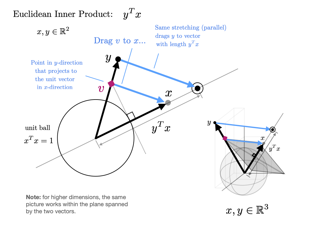
Source
thetas = np.linspace(0, 2*np.pi, 60)
v = np.array([1, 0])

frames = []

for theta in thetas:
    w = np.array([np.cos(theta), np.sin(theta)])

    dot = np.dot(v, w)

    proj = dot * v

    data = [
        go.Scatter(x=[0, v[0]], y=[0, v[1]],
                   mode='lines+markers',
                   name='v = first vector',
                   line=dict(width=4)),

        go.Scatter(x=[0, w[0]], y=[0, w[1]],
                   mode='lines+markers',
                   name='w = second vector',
                   line=dict(width=4)),

        go.Scatter(x=[0, proj[0]], y=[0, proj[1]],
                   mode='lines+markers',
                   name='projection',
                   line=dict(dash='dash', width=4)),

        go.Scatter(x=[w[0], proj[0]], y=[w[1], proj[1]],
                   mode='lines',
                   showlegend=False,
                   line=dict(dash='dot'))
    ]

    frames.append(go.Frame(
        data=data,
        name=str(round(theta,2)),
        layout=go.Layout(
            title=f"Dot Product = {dot:.2f}"
        )
    ))

fig = go.Figure(
    data=frames[0].data,
    frames=frames
)

fig.update_layout(
    sliders=[{
        "steps": [
            {"args": [[f.name],
                      {"frame": {"duration": 50, "redraw": True},
                       "mode": "immediate"}],
             "label": f.name,
             "method": "animate"}
            for f in frames
        ],
        "currentvalue": {"prefix": "θ: "}
    }],
    xaxis=dict(range=[-1.5,1.5]),
    yaxis=dict(range=[-1.5,1.5]),
    width=700,
    height=700
)

fig.show()Eigenvectors and eigenvalues
Given a square matrix, a scalar is called an eigenvalue of if there exists some nonzero vector in such that . The vector is the eigenvector associated with . The equation states that when an eigenvalue of is multiplied with , the result is simply a multiple of the eigenvector.
Here, the matrix transforms the vector to the vector .
Source
import numpy as np
import plotly.graph_objects as go

v = np.array([1, 3])
Av = np.array([7, 5])

proj = (np.dot(v, Av) / np.dot(Av, Av)) * Av

fig = go.Figure()
fig.add_shape(type="line", x0=-2, y0=0, x1=8, y1=0,
              line=dict(width=2))
fig.add_shape(type="line", x0=0, y0=-2, x1=0, y1=6,
              line=dict(width=2))

fig.add_annotation(
    x=v[0], y=v[1],
    ax=0, ay=0,
    xref="x", yref="y",
    axref="x", ayref="y",
    showarrow=True,
    arrowhead=3,
    arrowwidth=2
)

fig.add_annotation(
    x=Av[0], y=Av[1],
    ax=0, ay=0,
    xref="x", yref="y",
    axref="x", ayref="y",
    showarrow=True,
    arrowhead=3,
    arrowwidth=2
)

fig.add_annotation(
    x=proj[0], y=proj[1],
    ax=0, ay=0,
    xref="x", yref="y",
    axref="x", ayref="y",
    showarrow=True,
    arrowhead=3,
    arrowwidth=2
)

fig.add_annotation(x=1.2, y=3.2, text="x = (1,3)", showarrow=False)
fig.add_annotation(x=7.2, y=5.2, text="Ax = (7,5)", showarrow=False)

fig.update_layout(
    xaxis=dict(range=[-2, 8], zeroline=False),
    yaxis=dict(range=[-2, 6], zeroline=False),
    width=700,
    height=500,
    title="Vector Transformation under Matrix A"
)

fig.update_yaxes(scaleanchor="x", scaleratio=1)

fig.show()Thus, an eigenvector of is a nonzero vector such that when the map is applied, is merely scaled.
from numpy.linalg import eig

A = np.array([[1, 2],
              [2, 1]])

evals, evecs = eig(A)

print(*[f"λ = {evals[i]:.2f}, v = {evecs[:,i]}" for i in range(len(evals))], sep="\n")
λ = 3.00, v = [0.70710678 0.70710678]
λ = -1.00, v = [-0.70710678 0.70710678]
Source
A = np.array([[1, 2],
              [2, 1]])

evals, evecs = eig(A)
evecs = [evecs[:, 0], evecs[:, 1]]

xmin, xmax = -3, 3
ymin, ymax = -3, 3

fig = go.Figure()

fig.add_shape(type="line", x0=xmin, y0=0, x1=xmax, y1=0,
              line=dict(width=2))
fig.add_shape(type="line", x0=0, y0=ymin, x1=0, y1=ymax,
              line=dict(width=2))

for v in evecs:
    fig.add_annotation(
        x=v[0], y=v[1],
        ax=0, ay=0,
        xref="x", yref="y",
        axref="x", ayref="y",
        showarrow=True,
        arrowhead=3,
        arrowsize=1,
        arrowwidth=2,
        opacity=0.7
    )

for v in evecs:
    Av = A @ v
    fig.add_annotation(
        x=Av[0], y=Av[1],
        ax=0, ay=0,
        xref="x", yref="y",
        axref="x", ayref="y",
        showarrow=True,
        arrowhead=3,
        arrowsize=1,
        arrowwidth=2,
        opacity=0.7
    )

x_vals = np.linspace(xmin, xmax, 100)

for v in evecs:
    slope = v[1] / v[0]
    fig.add_trace(go.Scatter(
        x=x_vals,
        y=slope * x_vals,
        mode='lines',
        line=dict(width=1),
        showlegend=False
    ))

fig.update_layout(
    title="Eigenvectors ",
    xaxis=dict(range=[xmin, xmax], zeroline=False),
    yaxis=dict(range=[ymin, ymax], zeroline=False),
    width=700,
    height=700
)

fig.update_yaxes(scaleanchor="x", scaleratio=1)

fig.show()The eigenvalue equation is equivalent to .
This equation has a nonzero solution only when the columns of are linearly dependent.
This in turn is equivalent to stating the determinant is zero.
Hence, to find all eigenvalues, we can look for such that the determinant of is zero.
This problem can be expressed as one of solving for the roots of a polynomial in of degree .
This in turn implies the existence of solutions in the complex plane, although some might be repeated.
Linear Seperability
Hyperplanes
A decision rule tells us how to interpret the output of the model to make a decision on how to classify a datapoint. We commonly make decision rules by specifying a threshold, . If the predicted probability is greater than or equal to , predict Class 1. Otherwise, predict Class 0.
Using our decision rule, we can define a decision boundary as the “line” that splits the data into classes based on its features. For logistic regression, since we are working in dimensions, the decision boundary is a hyperplane -- a linear combination of the features in -dimensions -- and we can recover it from the final logistic regression model.
Source
T = 0.5
x = np.random.uniform(-5, 5, 50)
y = np.array([0 if xi < T else 1 for xi in x])

fig = go.Figure()

fig.add_trace(go.Scatter(
    x=x,
    y=np.zeros_like(x),
    mode='markers',
    marker=dict(color=y, colorscale='Viridis', size=12),
    name='Data points'
))

fig.add_shape(
    type="line",
    x0=T, x1=T,
    y0=-0.5, y1=0.5,
    line=dict(color="red", width=3, dash="dash"),
    name='Hyperplane'
)

fig.add_annotation(
    x=T, y=0.3, text="Hyperplane", showarrow=True, arrowhead=2, arrowcolor="red"
)

fig.update_layout(
    title="1D Hyperplane",
    xaxis_title="x",
    yaxis=dict(showticklabels=False),
    height=300,
    width=700
)

fig.show()Source
n = 50

x1 = np.random.uniform(-5, 5, n)
x2 = np.random.uniform(-5, 5, n)

w = np.array([1, 1])
T = 0.5

y = np.array([0 if w[0]*xi + w[1]*zi < T else 1 for xi, zi in zip(x1, x2)])

fig = go.Figure()

fig.add_trace(go.Scatter(
    x=x1,
    y=x2,
    mode='markers',
    marker=dict(color=y, colorscale='Viridis', size=10),
    name='Data points'
))

x_vals = np.linspace(-5, 5, 100)
y_vals = (T - w[0]*x_vals)/w[1]

fig.add_trace(go.Scatter(
    x=x_vals,
    y=y_vals,
    mode='lines',
    line=dict(color='red', width=3, dash='dash'),
    name='Hyperplane'
))

fig.update_layout(
    title="2D Hyperplane",
    xaxis_title="x1",
    yaxis_title="x2",
    width=700,
    height=600
)

fig.show()Source
n = 50
x1 = np.random.uniform(-5, 5, n)
x2 = np.random.uniform(-5, 5, n)
x3 = np.random.uniform(-5, 5, n)

w = np.array([1, 1, 1])
T = 0.5

y = np.array([0 if w[0]*xi + w[1]*zi + w[2]*zi2 < T else 1
              for xi, zi, zi2 in zip(x1, x2, x3)])

fig = go.Figure()

fig.add_trace(go.Scatter3d(
    x=x1,
    y=x2,
    z=x3,
    mode='markers',
    marker=dict(color=y, colorscale='Viridis', size=5),
    name='Data points'
))

xx, yy = np.meshgrid(np.linspace(-5, 5, 10), np.linspace(-5, 5, 10))
zz = (T - w[0]*xx - w[1]*yy) / w[2]

fig.add_trace(go.Surface(
    x=xx, y=yy, z=zz,
    opacity=0.5,
    colorscale=[[0, 'red'], [1, 'red']],
    showscale=False,
    name='Hyperplane'
))

fig.update_layout(
    title="3D Hyperplane Example",
    scene=dict(
        xaxis_title='x1',
        yaxis_title='x2',
        zaxis_title='x3'
    ),
    width=800,
    height=700
)

fig.show()In real life, however, that is often not the case, and we often see some overlap between points of different classes across the decision boundary. The true classes of the 2D data are shown below:
Source
n = 50
x1 = np.random.uniform(-5, 5, n)
x2 = np.random.uniform(-5, 5, n)

w = np.array([1, 1])
T = 0.5

linear_comb = w[0]*x1 + w[1]*x2

noise = np.random.normal(0, 4.0, n)
x2_noisy = x2 + noise
y = np.array([0 if val < T else 1 for val in linear_comb])

fig = go.Figure()

fig.add_trace(go.Scatter(
    x=x1,
    y=x2_noisy,
    mode='markers',
    marker=dict(color=y, colorscale='Viridis', size=10),
    name='Data points'
))

x_vals = np.linspace(-5, 5, 100)
y_vals = (T - w[0]*x_vals)/w[1]

fig.add_trace(go.Scatter(
    x=x_vals,
    y=y_vals,
    mode='lines',
    line=dict(color='red', width=3, dash='dash'),
    name='Hyperplane'
))

fig.update_layout(
    title="2D Hyperplane with Noise",
    xaxis_title="x1",
    yaxis_title="x2",
    width=700,
    height=600
)

fig.show()As you can see, the decision boundary predicted by our logistic regression does not perfectly separate the two classes. There’s a “muddled” region near the decision boundary where our classifier predicts the wrong class. What would the data have to look like for the classifier to make perfect predictions?
A classification dataset is said to be linearly separable if there exists a hyperplane among input features that separates the two classes .
This same definition holds in higher dimensions. If there are two features, the separating hyperplane must exist in two dimensions (any line of the form ). We can visualize this using a scatter plot.
When the dataset is linearly separable, a logistic regression classifier can perfectly assign datapoints into classes.
Here’s the question, can it achieve 0 cross entropy loss?
Cross entropy loss is 0 if p=1 when y=1, and p=0 when y=0.
This should be great! We can have 0 loss when we train the data on perfectly seperable data, however unxpected complications may arise.
Source
x = np.linspace(-10, 10, 400)
y = 1 / (1 + np.exp(-x))

fig = go.Figure()

fig.add_trace(go.Scatter(
    x=x,
    y=y,
    mode='lines',
    line=dict(color='blue', width=3),
    name='Sigmoid'
))

fig.update_layout(
    title='Sigmoid Function',
    xaxis_title='x',
    yaxis_title='σ(x)',
    width=700,
    height=500
)

fig.show()The sigmoid can never output exactly 0 or 1, so no finite optimal exists. When the data is linearly seperable, the optimal model parameters diverge to .
In order to deal with this situation, we employ the use of and regularization to prevent overfitting.
Support Vector Machines (SVM)
Support vector machines (SVMs) are a particularly powerful and flexible class of supervised algorithms for both classification and regression. In this section, we will develop the intuition behind support vector machines and their use in classification problems.
We simply find a line or curve (in two dimensions) or manifold (in multiple dimensions) that divides the classes from each other.
As an example of this, consider the simple case of a classification task, in which the two classes of points are well separated:
from sklearn.datasets import make_blobs
X, y = make_blobs(n_samples=50, centers=2,
                  random_state=0, cluster_std=0.60)
Source
fig = go.Figure()

fig.add_trace(go.Scatter(
    x=X[:, 0],
    y=X[:, 1],
    mode='markers',
    marker=dict(
        color=y,
        colorscale='YlOrRd',
        size=10,
        line=dict(width=1, color='black')
    ),
    name='Blobs'
))

fig.update_layout(
    title='2D Blob Scatter',
    xaxis_title='X1',
    yaxis_title='X2',
    width=700,
    height=600
)

fig.show()A linear discriminative classifier would attempt to draw a straight line separating the two sets of data, and thereby create a model for classification. For two dimensional data like that shown here, this is a task we could do by hand. But immediately we see a problem: there is more than one possible dividing line that can perfectly discriminate between the two classes!
We can draw them as follows:
Source
fig = go.Figure()

xfit = np.linspace(-1, 3.5, 100)
lines = [(1, 0.65), (0.5, 1.6), (-0.2, 2.9)]

fig.add_trace(go.Scatter(
    x=X[:, 0],
    y=X[:, 1],
    mode='markers',
    marker=dict(
        color=y,
        colorscale='YlOrRd',
        size=10,
        line=dict(width=1, color='black')
    ),
    name='Data points'
))

fig.add_trace(go.Scatter(
    x=[0.6],
    y=[2.1],
    mode='markers',
    marker=dict(color='red', symbol='x', size=12, line=dict(width=2)),
    name='Special point'
))

for m, b in lines:
    fig.add_trace(go.Scatter(
        x=xfit,
        y=m * xfit + b,
        mode='lines',
        line=dict(color='black'),
        showlegend=False
    ))

fig.update_layout(
    title='2D Blob Seperation',
    xaxis=dict(range=[-1, 3.5]),
    yaxis=dict(range=[min(X[:,1])-0.5, max(X[:,1])+0.5]),
    width=700,
    height=500
)

fig.show()These are three very different separators which, nevertheless, perfectly discriminate between these samples. Depending on which you choose, a new data point (e.g., the one marked by the “X” in this plot) will be assigned a different label! Evidently our simple intuition of “drawing a line between classes” is not enough, and we need to think a bit deeper.
Support vector machines offer one way to improve on this. The intuition is this: rather than simply drawing a zero-width line between the classes, we can draw around each line a margin of some width, up to the nearest point. Here is an example of how this might look:
Source
xfit = np.linspace(-1, 3.5, 200)
lines = [(1, 0.65, 0.33), (0.5, 1.6, 0.55), (-0.2, 2.9, 0.2)]

fig = go.Figure()

fig.add_trace(go.Scatter(
    x=X[:, 0],
    y=X[:, 1],
    mode='markers',
    marker=dict(
        color=y,
        colorscale='YlOrRd',
        size=10,
        line=dict(width=1, color='black')
    ),
    name='Data points'
))

for m, b, d in lines:
    yfit = m * xfit + b
    y_lower = yfit - d
    y_upper = yfit + d

    fig.add_trace(go.Scatter(
        x=np.concatenate([xfit, xfit[::-1]]),
        y=np.concatenate([y_upper, y_lower[::-1]]),
        fill='toself',
        fillcolor='rgba(170,170,170,0.4)',
        line=dict(color='rgba(255,255,255,0)'),
        showlegend=False,
        name='Band'
    ))

    fig.add_trace(go.Scatter(
        x=xfit,
        y=yfit,
        mode='lines',
        line=dict(color='black'),
        showlegend=False
    ))

fig.update_layout(
    title='Boundaries with Bands',
    xaxis=dict(range=[-1, 3.5]),
    yaxis=dict(range=[min(X[:,1])-0.5, max(X[:,1])+0.5]),
    width=700,
    height=500
)

fig.show()In support vector machines, the line that maximizes this margin is the one we will choose as the optimal model. Support vector machines are an example of such a maximum margin estimator.
Fitting a SVM
Let’s see the result of an actual fit to this data: we will use Scikit-Learn’s support vector classifier to train an SVM model on this data. For the time being, we will use a linear kernel and set the C parameter to a very large number (we’ll discuss the meaning of these in more depth momentarily).
from sklearn.svm import SVC # "Support vector classifier"
model = SVC(kernel='linear', C=1E10)
model.fit(X, y)To better visualize what’s happening here, let’s create a quick convenience function that will plot SVM decision boundaries for us:
Source
def plot_svc_decision_function_plotly(model, X, y, plot_support=True, grid_points=200):
    x_min, x_max = X[:,0].min() - 1, X[:,0].max() + 1
    y_min, y_max = X[:,1].min() - 1, X[:,1].max() + 1
    xx = np.linspace(x_min, x_max, grid_points)
    yy = np.linspace(y_min, y_max, grid_points)
    YY, XX = np.meshgrid(yy, xx)
    grid = np.c_[XX.ravel(), YY.ravel()]

    Z = model.decision_function(grid).reshape(XX.shape).T

    fig = go.Figure()

    # Decision boundary
    fig.add_trace(go.Contour(
        x=xx,
        y=yy,
        z=Z,
        showscale=False,
        contours=dict(start=0, end=0, coloring='lines', showlabels=True,
                      labelfont=dict(size=12, color='black')),
        line=dict(color='black', width=2),
        hoverinfo='skip'
    ))

    # Margins
    for level in [-1, 1]:
        fig.add_trace(go.Contour(
            x=xx,
            y=yy,
            z=Z,
            showscale=False,
            contours=dict(start=level, end=level, coloring='lines', showlabels=True,
                          labelfont=dict(size=12, color='black')),
            line=dict(color='black', width=2, dash='dash'),
            hoverinfo='skip'
        ))

    # Data points
    fig.add_trace(go.Scatter(
        x=X[:,0], y=X[:,1],
        mode='markers',
        marker=dict(color=y, colorscale='Viridis', size=10,
                    line=dict(width=1, color='black')),
        name='Data points'
    ))

    # Support vectors
    if plot_support:
        fig.add_trace(go.Scatter(
            x=model.support_vectors_[:,0], y=model.support_vectors_[:,1],
            mode='markers',
            marker=dict(size=15, color='rgba(0,0,0,0)',
                        line=dict(color='red', width=2)),
            name='Support vectors'
        ))

    fig.update_layout(
        title='SVC Decision Function (Plotly)',
        xaxis_title='X1',
        yaxis_title='X2',
        width=700,
        height=600
    )

    return fig
model = SVC(kernel='linear', C=1e5)
model.fit(X, y)
fig = plot_svc_decision_function_plotly(model, X, y)
fig.show()This is the dividing line that maximizes the margin between the two sets of points. Notice that a few of the training points just touch the margin: they are indicated by the black circles in this figure. These points are the pivotal elements of this fit, and are known as the support vectors, and give the algorithm its name. In Scikit-Learn, the identity of these points are stored in the support_vectors_ attribute of the classifier:
model.support_vectors_array([[0.44359863, 3.11530945],
[2.33812285, 3.43116792],
[2.06156753, 1.96918596]])A key to this classifier’s success is that for the fit, only the position of the support vectors matter; any points further from the margin which are on the correct side do not modify the fit! Technically, this is because these points do not contribute to the loss function used to fit the model, so their position and number do not matter so long as they do not cross the margin.
Next time: Kernels!