Lecture 11 - (17/03/2026)
Today’s Topics:
Hypothesis Testing
Linear Algebra Review (Moved to the following lecture)
Hypothesis Testing
Distribution Recap
If is a continuous random variable, then there exists unique nonnegative functions, and :
is the probability density function
is the cumulative distribution function
The total area under the curve is 1
Source
import numpy as np
import plotly.graph_objects as go
from scipy.stats import norm

mu, sigma = 0, 1
x = np.linspace(-4, 4, 400)
pdf = norm.pdf(x, mu, sigma)
cdf = norm.cdf(x, mu, sigma)

fig = go.Figure()

fig.add_trace(go.Scatter(
    x=x,
    y=pdf,
    mode="lines",
    name="PDF",
    line=dict(color="black")
))

fig.add_trace(go.Scatter(
    x=[],
    y=[],
    fill="tozeroy",
    mode="lines",
    fillcolor="rgba(0,100,255,0.4)",
    line=dict(width=0),
    name="Integrated Area"
))

fig.add_trace(go.Scatter(
    x=[],
    y=[],
    mode="lines",
    name="CDF",
    line=dict(color="red", width=3)
))

steps = []

for i in range(len(x)):
    xs = x[:i+1]
    ys_pdf = pdf[:i+1]
    ys_cdf = cdf[:i+1]

    step = dict(
        method="update",
        args=[{
            "x": [x, xs, xs],
            "y": [pdf, ys_pdf, ys_cdf]
        }],
        label=f"{x[i]:.2f}"
    )
    steps.append(step)

sliders = [dict(
    active=0,
    currentvalue={"prefix": "Integrate up to x = "},
    pad={"t": 50},
    steps=steps
)]

fig.update_layout(
    sliders=sliders,
    xaxis_title="x",
    yaxis_title="Value",
)

fig.show()The probability mass function (PMF) or the distribution of a random variable X provides the probability that X takes on each of its possible values.
If we let be the set of values that can take on, then the PMF of must:
Source
import numpy as np
import plotly.graph_objects as go
from scipy.stats import poisson

lam = 4
x = np.arange(0, 15)

pmf = poisson.pmf(x, lam)
cdf = poisson.cdf(x, lam)

fig = go.Figure()

fig.add_trace(go.Bar(
    x=x,
    y=pmf,
    name="PMF",
    marker_color="black"
))

fig.add_trace(go.Bar(
    x=[],
    y=[],
    name="Accumulated Mass",
    marker_color="rgba(0,100,255,0.6)"
))

fig.add_trace(go.Scatter(
    x=[],
    y=[],
    mode="lines+markers",
    name="CDF",
    line=dict(color="red", width=3)
))

steps = []

for i in range(len(x)):
    xs = x[:i+1]
    ys_pmf = pmf[:i+1]
    ys_cdf = cdf[:i+1]

    step = dict(
        method="update",
        args=[{
            "x": [x, xs, xs],
            "y": [pmf, ys_pmf, ys_cdf]
        }],
        label=str(x[i])
    )
    steps.append(step)

sliders = [dict(
    active=0,
    currentvalue={"prefix": "Sum up to x = "},
    pad={"t": 50},
    steps=steps
)]

fig.update_layout(
    sliders=sliders,
    xaxis_title="x",
    yaxis_title="Probability",
    barmode="overlay"
)

fig.show()A population refers to the entire set of individuals, objects, or data points that you want to study. Often times it is unrealistic to assume that we can analyze an entire population.
A sample is a subset of the population that is selected for analysis. It’s used when studying the entire population is impractical or impossible. Sampling allows for inferences about the population using statistical techniques.
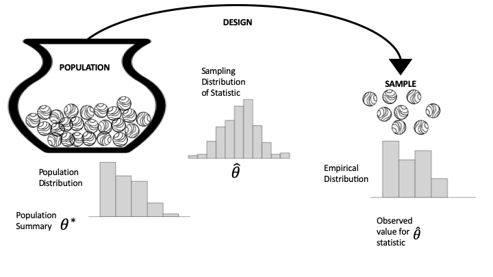
Left: population distribution, typically not observed.
Middle: the sampling distribution of the summary statistic. Determined by the population & the mechanism for sample selection.
Right: the empirical distribution from the sample.
Hypothesis Testing
In an ideal world, we would directly prove our hypothesis is true. Unfortunately, we often don’t have access to all the information needed to determine the truth. For example, we might hypothesize that a new vaccine is effective, but contemporary medicine doesn’t yet understand all the details of the biology that govern vaccine efficacy. Instead, we turn to the tools of probability, random sampling, and data design.
In a lot of ways, hypothesis testing is a lot like "proof by contradiction, where we assume the opposite of our hypothesis is true and try to show that the data we observe is inconsistent with that assumption. We approach the problem this way because often, something can be true for many reasons, but we only need a single example to contradict an assumption.
There are four basic steps to hypothesis testing:
Step 1: Set up
You have your data, and you want to test whether a particular model is reasonably consistent with the data. So you specify a statistic, , such as the sample average, fraction of zeros in a sample, or fitted regression coefficient, with the goal of comparing your data’s statistic to what might have been produced under the model.
Step 2: Model
You spell out the model that you want to test in the form of a data generation mechanism, along with any specific assumptions about the population. This model typically includes specifying , which may be the population mean, the proportion of zeros, or a regression coefficient. The sampling distribution of the statistic under this model is referred to as the null distribution, and the model itself is called the null hypothesis.
Step 3: Compute
How likely, according to the null model in step 2, is it to get data (and the resulting statistic) at least as extreme as what you actually got in step 1? In formal inference, this probability is called the -value. To approximate the -value, we often use the computer to generate a large number of repeated random trials using the assumptions in the model and find the fraction of samples that give a value of the statistic at least as extreme as our observed value. Other times, we can instead use mathematical theory to find the -value.
Step 4: Interpret
The -value is used as a measure of surprise. If the model that you spelled out in step 2 is believable, how surprised should you be to get the data (and summary statistic) that you actually got? A moderately sized -value means that the observed statistic is pretty much what you would expect to get for data generated by the null model. A tiny -value raises doubts about the null model. In other words, if the model is correct (or approximately correct), then it would be very unusual to get such an extreme value of the test statistic from data generated by the model. In this case, either the null model is wrong or a very unlikely outcome has occurred. Statistical logic says to conclude that the pattern is real; that it is more than just coincidence. Then it’s up to you to explain why the data generation process led to such an unusual value. This is when a careful consideration of the scope is important.
Let’s demonstrate these steps in the testing process with a couple of examples.
Coin-Flipping
Let’s say that we flipped 100 coins and observed 70 heads. We would like to use these data to test the hypothesis that the true probability is 0.5. First let’s generate our data, simulating 200,000 sets of 100 flips. We use such a large number because it turns out that it’s very rare to get 70 heads, so we need many attempts in order to get a reliable estimate of these probabilties.
num_runs = 200000

def toss_coins_and_count_heads(num_coins=100, p_heads=0.5):
    flips = np.random.rand(num_coins) > (1 - p_heads)
    return(np.sum(flips))


flip_results_df = pd.DataFrame({'n_heads': np.zeros(num_runs)})

for run in range(num_runs):
    flip_results_df.loc[run, 'n_heads'] = toss_coins_and_count_heads()
Now we can compute the proportion of samples from the distribution observed that landed on head for at least 70 times, when the true probability of heads is 0.5.
import scipy.stats

pvalue = 100 - scipy.stats.percentileofscore(flip_results_df['n_heads'], 70)
print(pvalue)
0.0024999999999977263
For comparison, we can also compute the p-value for 70 or more heads based on a null hypothesis of , using the binomial distribution.
compute the probability of 69 or fewer heads, when P(heads)=0.5
p_lt_70 = scipy.stats.binom.cdf(k=69, n=100, p=0.5)
p_lt_70np.float64(0.999960749301772)Time to failure
The time to failure, , of a part is known to be approximately normally distributed with a mean of 1000 hours and a standard deviation 20 hours. A new manufacturing process is proposed to increase the mean failure time by well over 300 hours. Data collected on 10 sample parts from the new manufacturing process yields the following times in hours. The new process will be implemented at the factory only if it can be shown to result in an increase in of at least 300 hours. Use a hypothesis test to determine if the new process should be adopted. Report the value.
| 1350 | 1320 | 1290 | 1280 | 1340 |
| 1210 | 1290 | 1350 | 1300 | 1310 |
The proper hypothesis test is
which calls for a one-sided -test; in particular, the right-tailed -test.
def ztest(arr, mu, std, side):
    """
    Args:
        arr - Array of sample values
        mu - Population mean
        std - Population standard deviation
        side - type of test/Ha (two-sided, greater, less)
    Returns:
        z_stat - The z-statistic
        p_value - The p-value for the test
    """
    # compute sample properties
    sample_mean = np.mean(arr)
    n = len(arr)

    # compute z-statistic
    z_stat = (sample_mean - mu) / (std / np.sqrt(n))

    # compute the p-value
    if tail == 'two-sided':
        p_value = 2 * norm.sf(np.abs(z_stat))
    elif tail == 'greater':
        p_value = norm.sf(z_stat)
    elif tail == 'less':
        p_value = norm.cdf(z_stat)

    return z_stat, p_value
# data
x = np.array([1350, 1320, 1290, 1280, 1340, 1210, 1290, 1350, 1300, 1310])
# constants
mu = 1300
sigma = 20
alpha = 0.05
tail = 'greater'
# run the test
z_stat, p_value = ztest(x, mu, sigma, tail)
print(f"The p-value is {p_value:.4f}")The p-value is 0.2635
Since the -value is , we cannot reject the null hypothesis and the new process is not adopted.
Indeed, the language is funny, but it reflects the fact that we’re evaluating the strength of the data against , rather than the strength in proving it true. In fact, could still be false (in the absolute sense), and we just simply didn’t collect the right data.
Wikipedia
It has been theorised that informal awards have a reinforcing effect on volunteer work, and this experiment was designed to formally study this conjecture. We will carry out a hypothesis test based on the rankings of the data.
import pandas as pd
import plotly.express as px

wiki = pd.read_csv("../attachments/Wikipedia.csv")
wikiThe dataframe has 200 rows, one for each contributor. The feature experiment is either 0 or 1, depending on whether the contributor was in the control or treatment group, respectively; and postproductivity is a count of the edits made by the contributor in the 90 days after the awards were made. The gap between the quartiles (lower, middle, and upper) suggests the distribution of productivity is skewed. We make a histogram to confirm:
px.histogram(wiki, x='postproductivity', nbins=50,
labels={'postproductivity':'Number of actions in 90 days post-award'})Indeed, the histogram of post-award productivity is highly skewed, with a spike near zero. The skewness suggests a statistic based on the ordering of the values from the two samples.
To compute our statistic, we order all productivity values (from both groups) from smallest to largest. The smallest value has rank 1, the second smallest rank 2, and so on, up to the largest value, which has a rank of 200.
We use these ranks to compute our statistic, , which is the average rank of the treatment group. We chose this statistic because it is insensitive to highly skewed distributions.
The null model assumes that an informal award has no effect on productivity, and any difference observed between the treatment and control groups is due to the chance process in assigning contributors to groups. The null hypothesis is set up for the status quo to be rejected; that is, we hope to find a surprise in assuming no effect.
We use the rankdata method in scipy.stats to rank the 200 values and compute the sum of ranks in the treatment group:
from scipy.stats import rankdata
ranks = rankdata(wiki['postproductivity'], 'average')
Let’s confirm that the average rank of the 200 values is 100.5:
np.average(ranks)np.float64(100.5)And find the average rank of the 100 productivity scores in the treatment group:
observed = np.average(ranks[100:])
observednp.float64(113.68)The average rank in the treatment group is higher than expected, but we want to figure out if it is an unusually high value. We can use simulation to find the sampling distribution for this statistic to see if 113 is a routine value or a surprising one.
To carry out this simulation, we set up the urn as the ranks array from the data. Shuffling the 200 values in the array and taking the first 100 represents a randomly sampled treatment group. We write a function to shuffle the array of ranks and find the average of the first 100.
rng = np.random.default_rng(42)
def rank_avg(ranks, n):
    rng.shuffle(ranks)
    return np.average(ranks[n:])
Our simulation mixes the marbles in the urn, draws 100 times, computes the average rank for the 100 draws, and repeats this 100,000 times.
rank_avg_simulation = [rank_avg(ranks, 100) for _ in range(100_000)] Here is a histogram of the simulated averages:
fig = px.histogram(x=rank_avg_simulation, nbins=50,
    labels=dict(x="Average rank of the treatment group"),
)
fig.add_annotation(
    x=93, y=9000, showarrow=False, text="Approximate<br>sampling distribution"
)
fig.show()As we expected, the sampling distribution of the average rank is centered on 100 (100.5 actually) and is bell-shaped. The center of this distribution reflects the assumptions of the treatment having no effect. Our observed statistic is well outside the typical range of simulated average ranks, and we use this simulated sampling distribution to find the approximate -value for observing a statistic at least as big as ours:
np.mean(rank_avg_simulation > observed)np.float64(0.00052)This is a big surprise. Under the null, the chance of seeing an average rank at least as large as ours is about 5 in 10,000.
This test raises doubt about the null model. Statistical logic has us conclude that the pattern is real. How do we interpret this? The experiment was well designed. The 200 contributors were selected at random from the top 1%, and then they were divided at random into two groups. These chance processes say that we can rely on the sample of 200 being representative of top contributors, and on the treatment and control groups being similar to each other in every way except for the application of the treatment (the award). Given the careful design, we conclude that informal awards have a positive effect on productivity for top contributors.
Earlier, we implemented a simulation to find the -value for our observed statistic. In practice, rank tests are commonly used and made available in most statistical software:
from scipy.stats import ranksums

ranksums(x=wiki.loc[wiki.experiment == 1, 'postproductivity'],
         y=wiki.loc[wiki.experiment == 0, 'postproductivity'])
RanksumsResult(statistic=np.float64(3.220386553232206), pvalue=np.float64(0.0012801785007519996))The -value here is twice the -value we computed because we considered only values greater than the observed, whereas the ranksums test computed the the -value for both sides of the distribution. In our example, we are only interested in an increase in productivity, and so use a one-sided -value, which is half the reported value (0.0006) and close to our simulated value.
Linear Algebra Recap
Vectors
A vector of length is just a sequence (or array, or tuple) of numbers, which we write as or .
The set of all -vectors is denoted by .
For example, is the plane, and a vector in is just a point in the plane.
Traditionally, vectors are represented visually as arrows from the origin to the point.
import plotly.graph_objects as go
Source
import plotly.graph_objects as go

vecs = [(2, 4), (-3, 3), (-4, -3.5)]

fig = go.Figure()

for v in vecs:
    fig.add_annotation(
        x=v[0], y=v[1],
        ax=0, ay=0,
        xref="x", yref="y",
        axref="x", ayref="y",
        showarrow=True,
        arrowhead=3,
        arrowsize=1.5,
        arrowwidth=3,
        arrowcolor="blue"
    )
    fig.add_annotation(
        x=1.1 * v[0],
        y=1.1 * v[1],
        text=str(v),
        showarrow=False
    )

fig.update_xaxes(
    zeroline=True, zerolinewidth=2, zerolinecolor='black',
    range=[-5, 5]
)
fig.update_yaxes(
    zeroline=True, zerolinewidth=2, zerolinecolor='black',
    range=[-5, 5]
)

fig.update_layout(
    width=800,
    height=800,
    template='plotly_white',
    xaxis=dict(showgrid=True, gridwidth=1, gridcolor='lightgray'),
    yaxis=dict(showgrid=True, gridwidth=1, gridcolor='lightgray')
)

fig.show()The two most common operators for vectors are addition and scalar multiplication.
When we add two vectors, we add them element-by-element
Scalar multiplication is an operation that takes a number and a vector and produces
Source
import numpy as np
import plotly.graph_objects as go

x = np.array([2, 2])
scalars = [-2, 2]

fig = go.Figure()

fig.add_annotation(
    x=x[0], y=x[1],
    ax=0, ay=0,
    xref="x", yref="y",
    axref="x", ayref="y",
    showarrow=True,
    arrowhead=3,
    arrowsize=1.5,
    arrowwidth=3,
    arrowcolor="blue"
)
fig.add_annotation(
    x=x[0] + 0.4,
    y=x[1] - 0.2,
    text='x',
    showarrow=False,
    font=dict(size=16)
)

for s in scalars:
    v = s * x
    fig.add_annotation(
        x=v[0], y=v[1],
        ax=0, ay=0,
        xref="x", yref="y",
        axref="x", ayref="y",
        showarrow=True,
        arrowhead=3,
        arrowsize=1.5,
        arrowwidth=3,
        arrowcolor="red",
        opacity=0.5
    )
    fig.add_annotation(
        x=v[0] + 0.4,
        y=v[1] - 0.2,
        text=f'{s}x',
        showarrow=False,
        font=dict(size=16)
    )

fig.update_xaxes(
    zeroline=True, zerolinewidth=2, zerolinecolor='black',
    range=[-5, 5]
)
fig.update_yaxes(
    zeroline=True, zerolinewidth=2, zerolinecolor='black',
    range=[-5, 5]
)

fig.update_layout(
    width=800,
    height=800,
    template='plotly_white',
    xaxis=dict(showgrid=True, gridwidth=1, gridcolor='lightgray'),
    yaxis=dict(showgrid=True, gridwidth=1, gridcolor='lightgray')
)

fig.show()In Python, a vector can be represented as a list or tuple, such as x = (2, 4, 6), but is more commonly
represented as a NumPy array.
One advantage of NumPy arrays is that scalar multiplication and addition have very natural syntax
x = np.ones(3) # Vector of three ones
y = np.array((2, 4, 6)) # Converts tuple (2, 4, 6) into array
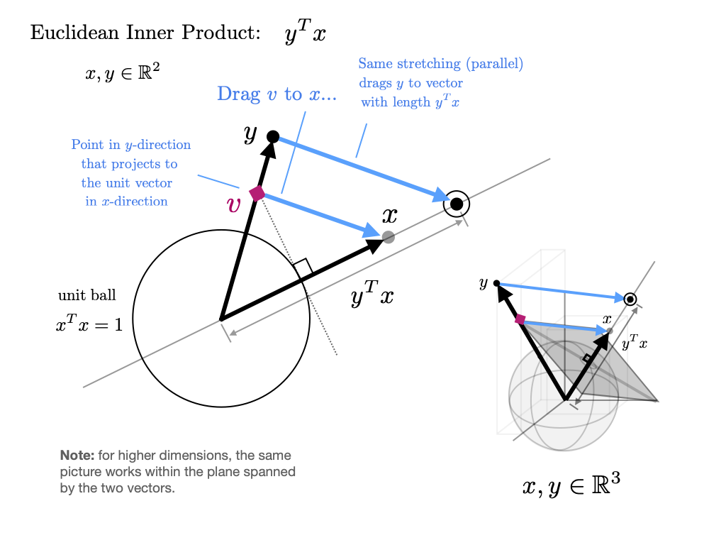
x + yarray([3., 5., 7.])Inner Products
The inner product(or dot product) of vectors is defined as
Two vectors are called orthogonal if their inner product is zero.
The norm of a vector represents its “length” (i.e., its distance from the zero vector) and is defined as
The expression is thought of as the distance between and .
It can be computed as follows:
np.sum(x * y) # Inner product of x and y, method 1np.float64(12.0)x @ y # Inner product of x and y, method 2 (preferred)np.float64(12.0)The @ operator is preferred because it uses optimized BLAS libraries that implement fused multiply-add operations, providing better performance and numerical accuracy compared to the separate multiply and sum operations.
np.sqrt(np.sum(x**2)) # Norm of x, take onenp.float64(1.7320508075688772)np.sqrt(x @ x) # Norm of x, take two (preferred)np.float64(1.7320508075688772)np.linalg.norm(x) # Norm of x, take threenp.float64(1.7320508075688772)