Lecture 3 - (05/02/2026)
Today’s Topics:
Information Visualization
Why should we visualize
Plotly Visualizations
Altair Visualizations
Information Visualization
Computer-based visualization systems provide visual representations of datasets designed to help people carry out tasks more effectively.
Three requirements
Users
Data
Tasks
A good visualization enables users to complete tasks effectively on the data.
When not to use vis
Don’t need vis when fully automatic solution exists and is trusted
But many analysis problems are ill-specified.
What vis allows for
Long-term use for end users (e.g., exploratory analysis of scientific data)
Presentation of known results
Stepping stone to better understanding of requirements before developing models
Helps developers of automatic solution refine/debug, determine parameters
Helps end users of automatic solutions verify, build trust
Why depend on vis?
Computer-based visualization systems provide visual representations of datasets designed to help people carry out tasks more effectively.
Human visual system is high-bandwidth channel to brain
Overview possible due to background processing
Subjective experience of seeing everything simultaneously
Significant processing occurs in parallel and pre-attentively
Sound: lower bandwidth and different semantics
Overview not supported
Subjective experience of sequential stream
Touch/haptics: impoverished record/replay capacity
Only very low-bandwidth communication thus far
Taste, smell: no viable record/replay devices
Why show data in detail?
Summaries lose information.
Confirm expected and find unexpected patterns.
Assess validity of statistical model.
Why should we visualize?
The purpose of visualization is insight, not pictures
import pandas as pd
import numpy as np
import plotly.graph_objects as go
from plotly.subplots import make_subplots

# Anscombe's quartet data
data = {
    "x1": [10, 8, 13, 9, 11, 14, 6, 4, 12, 7, 5],
    "y1": [8.04, 6.95, 7.58, 8.81, 8.33, 9.96, 7.24, 4.26, 10.84, 4.82, 5.68],
    "x2": [10, 8, 13, 9, 11, 14, 6, 4, 12, 7, 5],
    "y2": [9.14, 8.14, 8.74, 8.77, 9.26, 8.10, 6.13, 3.10, 9.13, 7.26, 4.74],
    "x3": [10, 8, 13, 9, 11, 14, 6, 4, 12, 7, 5],
    "y3": [7.46, 6.77, 12.74, 7.11, 7.81, 8.84, 6.08, 5.39, 8.15, 6.42, 5.73],
    "x4": [8, 8, 8, 8, 8, 8, 8, 19, 8, 8, 8],
    "y4": [6.58, 5.76, 7.71, 8.84, 8.47, 7.04, 5.25, 12.50, 5.56, 7.91, 6.89],
}


def summarize(x, y):
    x = np.array(x)
    y = np.array(y)

    mean_x = np.mean(x)
    var_x = np.var(x, ddof=1)
    mean_y = np.mean(y)
    var_y = np.var(y, ddof=1)
    corr = np.corrcoef(x, y)[0, 1]

    # Linear regression y = a + b x
    b, a = np.polyfit(x, y, 1)
    y_hat = a + b * x
    r2 = 1 - np.sum((y - y_hat)**2) / np.sum((y - np.mean(y))**2)

    return mean_x, var_x, mean_y, var_y, corr, a, b, r2

# Compute stats for each dataset
for i in range(1, 5):
    x = data[f"x{i}"]
    y = data[f"y{i}"]

    mean_x, var_x, mean_y, var_y, corr, a, b, r2 = summarize(x, y)

    print(f"Dataset {i}")
    print(f"Mean of x:\t\t{mean_x:.2f}")
    print(f"Variance of x:\t\t{var_x:.2f}")
    print(f"Mean of y:\t\t{mean_y:.2f}")
    print(f"Variance of y:\t\t{var_y:.3f}")
    print(f"Correlation x,y:\t{corr:.3f}")
    print(f"Linear regression:\ty = {a:.2f} + {b:.3f}x")
    print(f"R^2:\t\t\t{r2:.2f}")
    print("-" * 50)
Dataset 1
Mean of x: 9.00
Variance of x: 11.00
Mean of y: 7.50
Variance of y: 4.127
Correlation x,y: 0.816
Linear regression: y = 3.00 + 0.500x
R^2: 0.67
--------------------------------------------------
Dataset 2
Mean of x: 9.00
Variance of x: 11.00
Mean of y: 7.50
Variance of y: 4.128
Correlation x,y: 0.816
Linear regression: y = 3.00 + 0.500x
R^2: 0.67
--------------------------------------------------
Dataset 3
Mean of x: 9.00
Variance of x: 11.00
Mean of y: 7.50
Variance of y: 4.123
Correlation x,y: 0.816
Linear regression: y = 3.00 + 0.500x
R^2: 0.67
--------------------------------------------------
Dataset 4
Mean of x: 9.00
Variance of x: 11.00
Mean of y: 7.50
Variance of y: 4.123
Correlation x,y: 0.817
Linear regression: y = 3.00 + 0.500x
R^2: 0.67
--------------------------------------------------
# Create subplot layout
fig = make_subplots(
    rows=2,
    cols=2,
    subplot_titles=[f"Dataset {i}" for i in range(1, 5)]
)

for i in range(1, 5):
    x = data[f"x{i}"]
    y = data[f"y{i}"]

    # Regression line y = a + b x
    b, a = np.polyfit(x, y, 1)
    x_line = np.linspace(min(x), max(x), 100)
    y_line = a + b * x_line

    row = (i - 1) // 2 + 1
    col = (i - 1) % 2 + 1

    # Scatter points
    fig.add_trace(
        go.Scatter(
            x=x,
            y=y,
            mode="markers",
            name=f"Data {i}",
            showlegend=False
        ),
        row=row,
        col=col
    )

    # Regression line
    fig.add_trace(
        go.Scatter(
            x=x_line,
            y=y_line,
            mode="lines",
            name="Regression",
            showlegend=False
        ),
        row=row,
        col=col
    )

fig.update_layout(
    title="Anscombe’s Quartet: Same Statistics, Different Distributions",
    height=700,
    width=900
)

fig.show()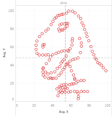
Another instance where this occured: The Datasaurus
Approaches to data analytics:
Traditional
Query for known patterns
Display results using traditional techniques
Pros:
Many solutions
Easier to implement
Cons:
Can’t search for the unexpected
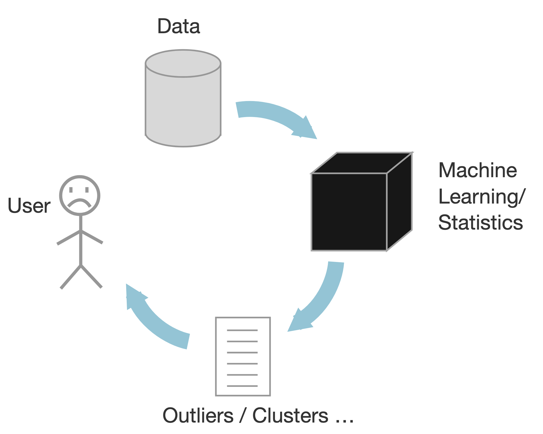
Data Mining/ML
Based on statistics
Black box approach
Output outliers and correlations
Human out of the loop
Pros:
Scalable
Cons:
Analysts have to make sense of the results
Makes assumptions on the data
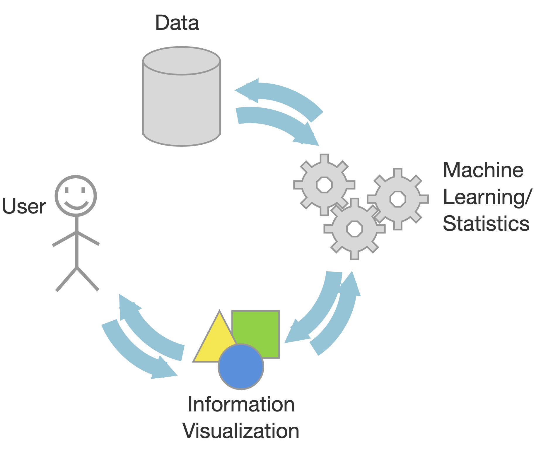
InfoVis
Visual interactive interfaces
Human in the loop
Pros:
Visual bandwidth is enormous
Experts decided what to search for
Identify unknown patterns and errors in the data
Cons:
Scalability can be an issue
In Infovis, we look for insights
Deep understanding
Meaningful
Non-obvious
Actionable
Based on data
An insight is:
Something that the user can learn from the data using the infovis
Which she didn’t know/expect
Also, is useful/needed for her
Moreover, she didn’t know of it
And that she can leverage
Some of the major tools used for visualization:
D3
Vega-lite
Altair
Tableau
Plotly Visualization
Plotly is a powerful, open-source data visualization library used to create interactive, publication-quality graphs and dashboards, supporting languages like Python, R, and JavaScript.
import plotly.express as px
import numpy as np

x = np.random.randn(1000)
y = np.random.randn(1000)
color = np.random.permutation(1000)

fig = px.scatter(x,y, color=color)
fig.show()Plotting with plotly (and matplotlib):
Strengths
Designed like MatLab: switching was/is easy
Many rendering backends
Can reproduce just about any plot (with a bit of effort)
Well-tested, standard tool for the last 10 years
Weaknesses
Designed like MatLab
API is imperative and often overly verbose
Slow with large datasets
Can have a steep learning curve with lots of memorization
Statistical Visualization
Data in column-oriented format; i.e. rows are samples, columns are features
iris = px.data.iris()
iris.head()Statistical Visualization: Grouping
import plotly.graph_objects as go

color_map = {
    'setosa': 'blue',
    'versicolor': 'green',
    'virginica': 'red'
}

fig = go.Figure()

for species, group in iris.groupby('species'):
    fig.add_trace(
        go.Scatter(
            x=group['petal_length'],
            y=group['sepal_width'],
            mode='markers',
            name=species,
            marker=dict(
                color=color_map[species],
                opacity=0.3
            )
        )
    )

fig.update_layout(xaxis_title='Petal Length', yaxis_title='Sepal Width')

fig.show()
Statistical Visualization: Faceting
import plotly.graph_objects as go
from plotly.subplots import make_subplots

color_map = dict(zip(
    iris.species.unique(),
    ['blue', 'green', 'red']
))

n_panels = len(color_map)

fig = make_subplots(
    rows=1,
    cols=n_panels,
    shared_xaxes=True,
    shared_yaxes=True,
    subplot_titles=list(color_map.keys())
)

for i, (species, group) in enumerate(iris.groupby('species'), start=1):
    fig.add_trace(
        go.Scatter(
            x=group['petal_length'],
            y=group['sepal_width'],
            mode='markers',
            name=species,
            marker=dict(
                color=color_map[species],
                opacity=0.3
            ),
            showlegend=False  # legend per-panel is redundant
        ),
        row=1,
        col=i
    )

fig.update_layout(
    xaxis_title='petal_length',
    yaxis_title='sepal_width',
    height=350,
    width=n_panels * 350
)

fig.show()
Problem: We’re mixing the what with the how
Declarative Visualization
Imperative
Specify How something should be done.
Specification and Execution intertwined.
“Put a red circle here, and a blue circle here”.
Declarative
Specify What should be done.
Separates Specification from Execution.
“Map to a position, and to a color".
Declarative visualization lets you think about data and relationships, rather than incidental details.
Altair Visualization
Declarative visualization in Python using the Vega grammar (Visualization Grammar)
Vega is a visualization grammar (a language) and a library for server- and client-side visualizations. A live benchmark showing client-side performance of Vega on differently sized datasets is presented. A Python program that generate experiments used in the article is presented as well.
The “grammar” is far from trivial, but once you get a hang of it, creating graphs can be relatively painless and even enjoyable process. The docs are extremely helpful and definitely worth checking out. There is also a simplified version of the framework called “Vega Lite”
import altair as alt

iris = px.data.iris()

alt.Chart(iris).mark_point().encode(
    x='petal_length',
    y='sepal_width',
    color='species'
)Encodings are flexible:
import altair as alt

iris = px.data.iris()

alt.Chart(iris).mark_point().encode(
    x='petal_length',
    y='sepal_width',
    color='species',
    column='species'
)Altair is interactive
import altair as alt

iris = px.data.iris()

alt.Chart(iris).mark_point().encode(
    x='petal_length',
    y='sepal_width',
    color='species'
).interactive()Basics of an Altair Chart
import altair as alt

iris = px.data.iris()

alt.Chart(iris).mark_point().encode(
    x='petal_length:Q',
    y='sepal_width:Q',
    color='species:N'
)Anatomy of an Altair Chart
Chart assumes tabular, column-oriented data. It supports pandas dataframes, CSVs, TSVs, JSONs.
alt.Chart(iris)
Chart uses one of the several pre-defined marks:
point
line
bar
area
rect
geoshape
text
circle
square
rule
tick
alt.Chart(iris).mark_xxxxx()
Encoding map visual channels to data columns
Channels are automatically adjusted based on data type (N, O, Q, T)
| Letter | Type | Meaning | Examples |
|---|---|---|---|
| N | Nominal | Categories, no order | "species", "country" |
| O | Ordinal | Ordered categories | "low" < "medium" < "high" |
| Q | Quantitative | Numeric, measurable | height, price, count |
| T | Temporal | Date / time | "2024-01-01", timestamps |
Available channels:
Position (x,y)
Facet (row, column)
Color
Shape
Size
Text
Opacity
Stroke
Fill
Latitude/Longitude
import altair as alt

iris = px.data.iris()

json = alt.Chart(iris).mark_point().encode(
    x='petal_length:Q',
    y='sepal_width:Q',
    color='species:N'
).to_json()
Using this JSON, you can view it in: Vega-Studio
import altair as alt

url = "https://gist.githubusercontent.com/armgilles/194bcff35001e7eb53a2a8b441e8b2c6/raw/92200bc0a673d5ce2110aaad4544ed6c4010f687/pokemon.csv"

chart = alt.Chart(url).mark_circle().encode(
    x='Attack:Q',
    y='Defense:Q',
    row='Generation:N',
    column='Legendary:N'
)

chart
chart = alt.Chart(url).mark_bar().encode(
    y=alt.Y('Generation:N'),
    x=alt.X('*:Q', aggregate='count', stack='normalize'),
    color=alt.Color('Legendary:N')
)

chart
url = "https://raw.githubusercontent.com/rfordatascience/tidytuesday/master/data/2019/2019-06-25/ufo_sightings.csv"

chart = (
    alt.Chart(url)
    .mark_circle(size=4, opacity=0.5)
    .encode(
        x='longitude:Q',
        y='latitude:Q',
        color='shape:N',
        tooltip=[
            'date_time:T',
            'ufo_shape:N',
            'state:N',
            'encounter_length:Q'
        ]
    )
)

chart