Lecture 17 - (28/04/2026)
Today’s Topics:
Weaknesses of -means
Gausian Mixture Models
GMM Density Estimation
Histogram Density
Kernel Density Estimation
Weaknesses of -means
The -means clustering model from last time is simple and relatively easy to understand, but its simplicity leads to practical challenges in its application. In particular, the non-probabilistic nature of -means and its use of simple distance-from-cluster-center to assign cluster membership leads to poor performance for many real-world situations.
import matplotlib.pyplot as plt
import seaborn as sns; sns.set()
import plotly.express as px
import plotly.graph_objects as go
from sklearn.cluster import KMeans
from scipy.spatial.distance import cdist
from scipy.stats import norm
import sklearn
import numpy as np
As we saw last lecture, given simple, well-separated data, -means finds suitable clustering results.
For example, if we have simple blobs of data, the -means algorithm can quickly label those clusters in a way that closely matches what we might do by eye:
# Generate some data
from sklearn.datasets import make_blobs
X, y_true = make_blobs(n_samples=400, centers=4,
                       cluster_std=0.60, random_state=0)
X = X[:, ::-1]
from sklearn.cluster import KMeans
kmeans = KMeans(4, random_state=0)
labels = kmeans.fit(X).predict(X)
px.scatter(x=X[:, 0], y=X[:, 1], color=labels, color_continuous_scale='viridis')From an intuitive standpoint, we might expect that the clustering assignment for some points is more certain than others: for example, there appears to be a very slight overlap between the two middle clusters, such that we might not have complete confidence in the cluster assigment of points between them. Unfortunately, the k-means model has no intrinsic measure of probability or uncertainty of cluster assignments.
One way to think about the k-means model is that it places a circle (or, in higher dimensions, a hyper-sphere) at the center of each cluster, with a radius defined by the most distant point in the cluster. This radius acts as a hard cutoff for cluster assignment within the training set: any point outside this circle is not considered a member of the cluster.
Source
def plot_kmeans(kmeans, X, n_clusters=4, rseed=0):
    labels = kmeans.fit_predict(X)

    # Scatter points
    fig = go.Figure()

    fig.add_trace(go.Scatter(
        x=X[:, 0],
        y=X[:, 1],
        mode='markers',
        marker=dict(
            size=8,
            color=labels,
            colorscale='Viridis',
            showscale=True
        ),
        name='Data'
    ))

    # Compute centers and radii
    centers = kmeans.cluster_centers_
    radii = [
        cdist(X[labels == i], [center]).max()
        for i, center in enumerate(centers)
    ]

    # Add circles as shapes
    shapes = []
    for center, r in zip(centers, radii):
        shapes.append(dict(
            type="circle",
            xref="x",
            yref="y",
            x0=center[0] - r,
            y0=center[1] - r,
            x1=center[0] + r,
            y1=center[1] + r,
            line=dict(color="rgba(150,150,150,0.8)", width=3),
            fillcolor="rgba(200,200,200,0.3)"
        ))

    fig.update_layout(
        shapes=shapes,
        xaxis=dict(scaleanchor="y"),  # equal aspect ratio
        yaxis=dict(),
        title="KMeans Clustering"
    )

    return fig
kmeans = KMeans(n_clusters=4, random_state=0)
plot_kmeans(kmeans, X)An important observation for k-means is that these cluster models must be circular: k-means has no built-in way of accounting for oblong or elliptical clusters. So, for example, if we take the same data and transform it, the cluster assignments end up becoming muddled:
rng = np.random.RandomState(13)
X_stretched = np.dot(X, rng.randn(2, 2))

kmeans = KMeans(n_clusters=4, random_state=0)
plot_kmeans(kmeans, X_stretched)By eye, we recognize that these transformed clusters are non-circular, and thus circular clusters would be a poor fit. Nevertheless, k-means is not flexible enough to account for this, and tries to force-fit the data into four circular clusters.
These two disadvantages of k-means:
its lack of flexibility in cluster shape
its lack of probabilistic cluster assignment
mean that for many datasets (especially low-dimensional datasets) it may not perform as well as you might hope.
Gaussian Mixture Models
A Gaussian mixture model (GMM) attempts to find a mixture of multi-dimensional Gaussian probability distributions that best model any input dataset. In the simplest case, GMMs can be used for finding clusters in the same manner as k-means:
from sklearn.mixture import GaussianMixture
gmm = GaussianMixture(n_components=4).fit(X)
labels = gmm.predict(X)
px.scatter(x=X[:, 0], y=X[:, 1], color=labels, color_continuous_scale='viridis')But because GMM contains a probabilistic model under the hood, it is also possible to find probabilistic cluster assignments - in Scikit-Learn this is done using the predict_proba method. This returns a matrix of size [n_samples, n_clusters] which measures the probability that any point belongs to the given cluster:
probs = gmm.predict_proba(X)
print(probs[:5].round(3))
[[0.531 0.469 0. 0. ]
[0. 0. 0. 1. ]
[0. 0. 0. 1. ]
[1. 0. 0. 0. ]
[0. 0. 0. 1. ]]
We can visualize this uncertainty by, for example, making the size of each point proportional to the certainty of its prediction; looking at the following figure, we can see that it is precisely the points at the boundaries between clusters that reflect this uncertainty of cluster assignment:
size = 10 * probs.max(1) ** 2
px.scatter(x=X[:, 0], y=X[:, 1], color=labels, color_continuous_scale='viridis', size=size)Under the hood, a Gaussian mixture model is very similar to k-means: it uses an expectation–maximization approach which qualitatively does the following:
Choose starting guesses for the location and shape
Repeat until converged:
E-step: for each point, find weights encoding the probability of membership in each cluster
M-step: for each cluster, update its location, normalization, and shape based on all data points, making use of the weights
The result of this is that each cluster is associated not with a hard-edged sphere, but with a smooth Gaussian model. Just as in the k-means expectation–maximization approach, this algorithm can sometimes miss the globally optimal solution, and thus in practice multiple random initializations are used.
Source
def draw_ellipse(fig, position, covariance, weight, w_factor):
    # SVD to get axes and rotation
    if covariance.shape == (2, 2):
        U, s, _ = np.linalg.svd(covariance)
        angle = np.arctan2(U[1, 0], U[0, 0])
        width, height = 2 * np.sqrt(s)
    else:
        angle = 0
        width, height = 2 * np.sqrt(covariance)

    t = np.linspace(0, 2*np.pi, 100)

    for nsig in range(1, 4):
        # ellipse parametric form
        x = nsig * width / 2 * np.cos(t)
        y = nsig * height / 2 * np.sin(t)

        # rotation
        R = np.array([
            [np.cos(angle), -np.sin(angle)],
            [np.sin(angle),  np.cos(angle)]
        ])
        ellipse = R @ np.vstack((x, y))

        fig.add_trace(go.Scatter(
            x=ellipse[0] + position[0],
            y=ellipse[1] + position[1],
            mode='lines',
            line=dict(width=2),
            opacity=weight * w_factor * 3,
            showlegend=False
        ))


def plot_gmm(gmm, X, label=True):
    labels = gmm.fit(X).predict(X)

    fig = go.Figure()

    # scatter points
    fig.add_trace(go.Scatter(
        x=X[:, 0],
        y=X[:, 1],
        mode='markers',
        marker=dict(
            size=8,
            color=labels if label else None,
            colorscale='Viridis',
            showscale=label
        ),
        name='Data'
    ))

    # equal aspect ratio
    fig.update_layout(
        xaxis=dict(scaleanchor="y"),
        title="Gaussian Mixture Model"
    )

    # draw ellipses
    w_factor = 0.2 / gmm.weights_.max()

    for pos, covar, w in zip(gmm.means_, gmm.covariances_, gmm.weights_):
        draw_ellipse(fig, pos, covar, w, w_factor)

    return fig
With this in place, we can take a look at what the four-component GMM gives us for our initial data:
gmm = GaussianMixture(n_components=4, random_state=42)
plot_gmm(gmm, X)Similarly, we can use the GMM approach to fit our stretched dataset; allowing for a full covariance the model will fit even very oblong, stretched-out clusters:
gmm = GaussianMixture(n_components=4, covariance_type='full', random_state=42)
plot_gmm(gmm, X_stretched)GMM Density Estimation
Though GMM is often categorized as a clustering algorithm, fundamentally it is an algorithm for density estimation. That is to say, the result of a GMM fit to some data is technically not a clustering model, but a generative probabilistic model describing the distribution of the data.
from sklearn.datasets import make_moons
Xmoon, ymoon = make_moons(200, noise=.05, random_state=0)
px.scatter(x=Xmoon[:, 0], y=Xmoon[:, 1])If we try to fit this with a two-component GMM viewed as a clustering model, the results are not particularly useful:
gmm2 = GaussianMixture(n_components=2, covariance_type='full', random_state=0)
plot_gmm(gmm2, Xmoon)But if we instead use many more components and ignore the cluster labels, we find a fit that is much closer to the input data:
gmm16 = GaussianMixture(n_components=16, covariance_type='full', random_state=0)
plot_gmm(gmm16, Xmoon, label=False)Here the mixture of 16 Gaussians serves not to find separated clusters of data, but rather to model the overall distribution of the input data. This is a generative model of the distribution, meaning that the GMM gives us the recipe to generate new random data distributed similarly to our input. For example, here are 400 new points drawn from this 16-component GMM fit to our original data:
Xnew, ynew = gmm16.sample(400)
px.scatter(x=Xnew[:, 0], y=Xnew[:, 1])How many components to use?
The fact that GMM is a generative model gives us a natural means of determining the optimal number of components for a given dataset. A generative model is inherently a probability distribution for the dataset, and so we can simply evaluate the likelihood of the data under the model, using cross-validation to avoid over-fitting.
Another means of correcting for over-fitting is to adjust the model likelihoods using some analytic criterion such as the Akaike information criterion (AIC) or the Bayesian information criterion (BIC).
Let’s look at the AIC and BIC as a function as the number of GMM components for our moon dataset:
n_components = np.arange(1, 21)

models = [
    GaussianMixture(n_components=n, covariance_type='full', random_state=0).fit(Xmoon)
    for n in n_components
]

bic = [m.bic(Xmoon) for m in models]
aic = [m.aic(Xmoon) for m in models]

fig = go.Figure()

fig.add_trace(go.Scatter(
    x=n_components,
    y=bic,
    mode='lines+markers',
    name='BIC'
))

fig.add_trace(go.Scatter(
    x=n_components,
    y=aic,
    mode='lines+markers',
    name='AIC'
))

fig.update_layout(
    title="Model Selection: BIC vs AIC",
    xaxis_title="n_components",
    yaxis_title="Score",
    legend=dict(x=0.01, y=0.99)
)

fig.show()The optimal number of clusters is the value that minimizes the AIC or BIC, depending on which approximation we wish to use.
The AIC tells us that our choice of 16 components above was probably too many: around 8-12 components would have been a better choice.
The BIC says that we should opt for a simpler model around 5-8 components.
Notice the important point: this choice of number of components measures how well GMM works as a density estimator, not how well it works as a clustering algorithm. I’d recommed you to think of GMM primarily as a density estimator, and use it for clustering only when warranted within simple datasets.
Histograms Density
For one dimensional data, you are probably already familiar with one simple density estimator: the histogram. A histogram divides the data into discrete bins, counts the number of points that fall in each bin, and then visualizes the results in an intuitive manner.
For example, let’s create some data that is drawn from two normal distributions:
def make_data(N, f=0.3, rseed=1):
    rand = np.random.RandomState(rseed)
    x = rand.randn(N)
    x[int(f * N):] += 5
    return x

x = make_data(1000)
We have previously seen that the standard count-based histogram. By specifying the normed parameter of the histogram, we end up with a normalized histogram where the height of the bins does not reflect counts, but instead reflects probability density:
px.histogram(x=x, nbins=30, histnorm='density')One of the issues with using a histogram as a density estimator is that the choice of bin size and location can lead to representations that have qualitatively different features.
But what if, instead of stacking the blocks aligned with the bins, we were to stack the blocks aligned with the points they represent? If we do this, the blocks won’t be aligned, but we can add their contributions at each location along the x-axis to find the result. Let’s try this:
x_d = np.linspace(-4, 10, 2000)
density = sum((abs(xi - x_d) < 0.5) for xi in x)

fig = go.Figure()

# Filled density area
fig.add_trace(go.Scatter(
    x=x_d,
    y=density,
    mode='lines',
    fill='tozeroy',
    opacity=0.5,
    name='Density'
))

# Rug plot (ticks at bottom)
fig.add_trace(go.Scatter(
    x=x,
    y=np.full_like(x, -0.1),
    mode='markers',
    marker=dict(symbol='line-ns-open', size=10),
    name='Samples'
))

# Axis limits
fig.update_layout(
    xaxis=dict(range=[-4, 10]),
    yaxis=dict(range=[-0.2, 300]),
    title="Density Estimate with Rug Plot"
)

fig.show()The result looks a bit messy, but is a much more robust reflection of the actual data characteristics than is the standard histogram. Still, the rough edges are not aesthetically pleasing, nor are they reflective of any true properties of the data. In order to smooth them out, we might decide to replace the blocks at each location with a smooth function, like a Gaussian. Let’s use a standard normal curve at each point instead of a block:
density = sum(norm(xi).pdf(x_d) for xi in x)

fig = go.Figure()

# Filled density curve
fig.add_trace(go.Scatter(
    x=x_d,
    y=density,
    mode='lines',
    fill='tozeroy',
    opacity=0.5,
    name='Density'
))

# Rug plot
fig.add_trace(go.Scatter(
    x=x,
    y=np.full_like(x, -0.1),
    mode='markers',
    marker=dict(symbol='line-ns-open', size=10, color='black'),
    name='Samples'
))

# Axis limits
fig.update_layout(
    xaxis=dict(range=[-4, 10]),
    yaxis=dict(range=[-0.2, 250]),
    title="Gaussian KDE via Summed PDFs"
)

fig.show()This smoothed-out plot, with a Gaussian distribution contributed at the location of each input point, gives a much more accurate idea of the shape of the data distribution, and one which has much less variance (i.e., changes much less in response to differences in sampling).
These last two plots are examples of kernel density estimation in one dimension: the first uses a so-called “tophat” kernel and the second uses a Gaussian kernel. We’ll now look at kernel density estimation in more detail.
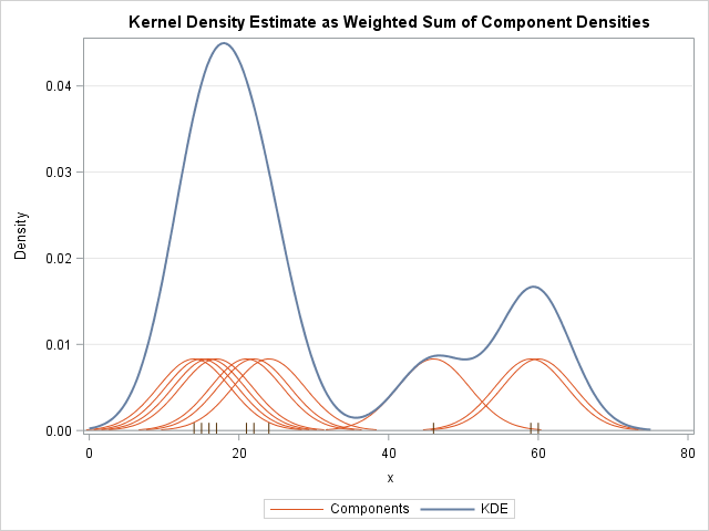
Kernel Density Estimation
The free parameters of kernel density estimation are the kernel, which specifies the shape of the distribution placed at each point, and the kernel bandwidth, which controls the size of the kernel at each point.
Let’s first show a simple example of replicating the above plot using the Scikit-Learn KernelDensity estimator:
from sklearn.neighbors import KernelDensity

# fit KDE
kde = KernelDensity(bandwidth=1.0, kernel='gaussian')
kde.fit(x[:, None])

# evaluate density
x_d = np.linspace(x.min() - 2, x.max() + 2, 1000)
logprob = kde.score_samples(x_d[:, None])
density = np.exp(logprob)

fig = go.Figure()

# KDE curve with fill
fig.add_trace(go.Scatter(
    x=x_d,
    y=density,
    mode='lines',
    fill='tozeroy',
    opacity=0.5,
    name='KDE'
))

# rug plot
fig.add_trace(go.Scatter(
    x=x,
    y=np.full_like(x, -0.01),
    mode='markers',
    marker=dict(symbol='line-ns-open', color='black', size=10),
    name='Samples'
))

fig.show()Selecting the bandwidth via cross-validation
The choice of bandwidth within KDE is extremely important to finding a suitable density estimate, and is the knob that controls the bias–variance trade-off in the estimate of density: too narrow a bandwidth leads to a high-variance estimate (i.e., over-fitting), where the presence or absence of a single point makes a large difference. Too wide a bandwidth leads to a high-bias estimate (i.e., under-fitting) where the structure in the data is washed out by the wide kernel.
from sklearn.model_selection import GridSearchCV, LeaveOneOut

bandwidths = 10 ** np.linspace(-1, 1, 100)

grid = GridSearchCV(
    KernelDensity(kernel='gaussian'),
    {'bandwidth': bandwidths},
    cv=LeaveOneOut()
)

grid.fit(x[:, None])Now we can find the choice of bandwidth which maximizes the score (which in this case defaults to the log-likelihood):
grid.best_params_{'bandwidth': np.float64(0.35111917342151316)}Perhaps the most common use of KDE is in graphically representing distributions of points. For example, in the Seaborn visualization library, KDE is built in and automatically used to help visualize points in one and two dimensions.
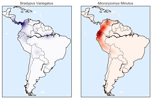
Here we will look at a slightly more sophisticated use of KDE for visualization of distributions. We will make use of some geographic data that can be loaded with Scikit-Learn: the geographic distributions of recorded observations of two South American mammals, Bradypus variegatus (the Brown-throated Sloth) and Microryzomys minutus (the Forest Small Rice Rat).
With Scikit-Learn, we can fetch this data as follows:
Unfortunately, this doesn’t give a very good idea of the density of the species, because points in the species range may overlap one another. You may not realize it by looking at this plot, but there are over 1,600 points shown here!
Let’s use kernel density estimation to show this distribution in a more interpretable way: as a smooth indication of density on the map.